What Is Mid-Century Modern Interior Design?
2024-10-07 · Arkiste
Mid-century modern is one of the best overall examples of a generational shift in interior design. Its focus is simple. Organic and manmade materials come together. Clean lines with soft corners are notable. This post-war design era design brings with it more functionality and less formality.
Let’s dive into what this design trend is and what it means to today’s resurgence of the theme.
Where Did Mid-Century Modern Start?
Mid-century modern (MCM) era begins around 1945, after the war. It would continue through 1975. New materials were present thanks to the introduction to plastics. Factories no longer producing supplies for war could shift to mass-produce furniture and home décor.
People changed at this time, too. Their way of life and culture were significantly different from the prior generation. That’s what helped to make mid-century modern such a bright, bold change from the previous, more formal décor.
But where did mid-century modern originate?
Mid-century modern originated in the US. It was influenced by German Bauhaus design, though. The Bauhaus architectural design was a precursor to MCM. It, too, had clean lines and a more futuristic look.
After World War II, numerous German interior designers moved to the US. By the mid-1950s, they were influencing a wide range of American design. Some of the most notable mid-century modern designers include:
-
Eero Saarinen
-
Arne Jacobsen
-
Herman Miller
-
Charles and Ray Eames
-
Isamu Noguchi
-
Cara Greenberg
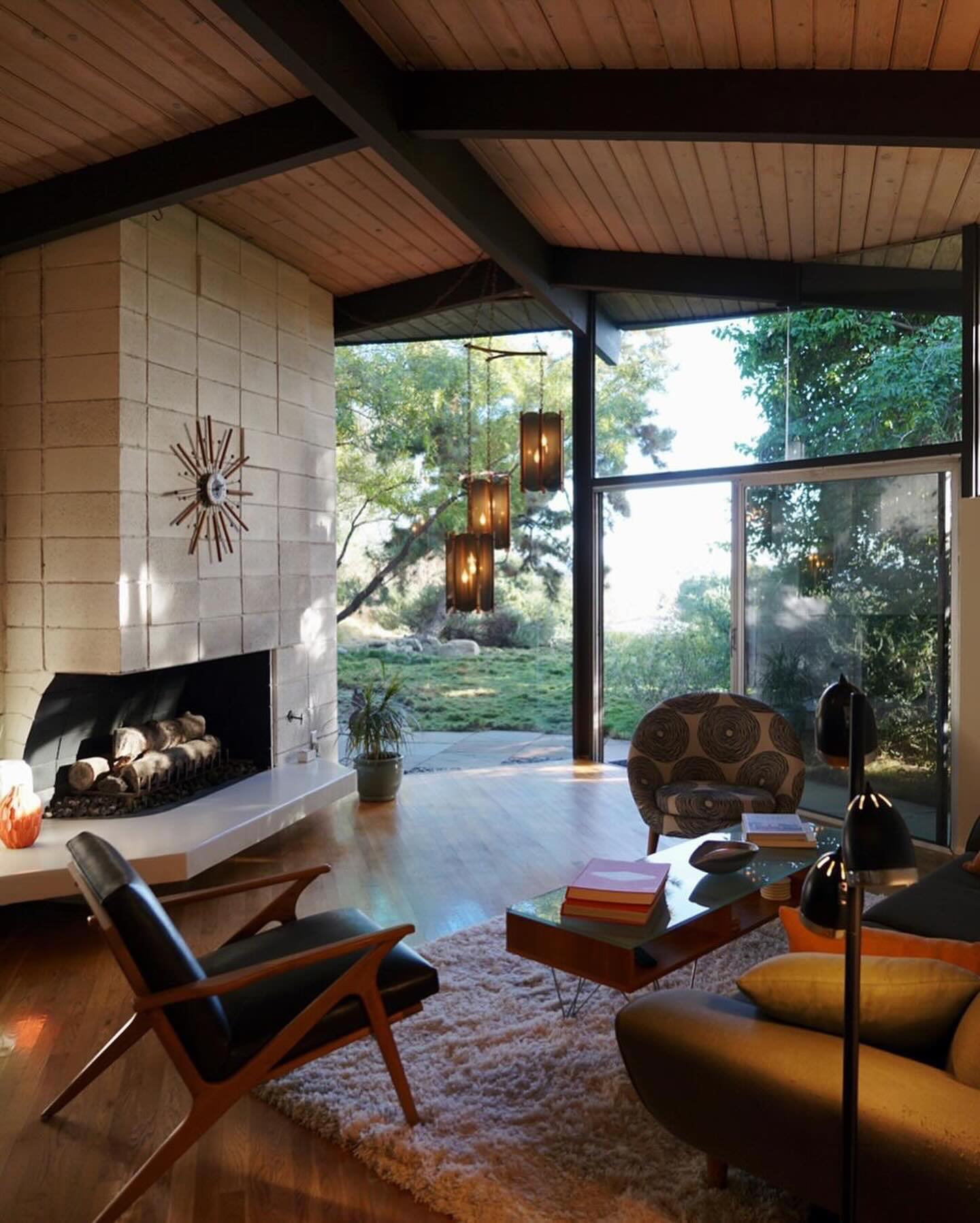 photo by @for_living_in
What Mid-Century Modern Furniture Looks Like
There are several specific characteristics of MCM design.
Minimalistic
Simple furniture with sleek lines is common. The design focuses on function. Spaces are left uncluttered with fewer ornate elements.
One example is in the chairs and tables. Most are a wood structure or may be a metal pin-style leg. They often have simple materials.
Material and Aesthetic Mixtures
This was the era of new materials like lucite and plastic entering the design world. Vinyl and fibreglass were also prominently available.
Yet, natural materials like metal, glass, and wood, still remained heavily present. It’s the combination of both that helped to set a new trend in this era. Vinyl-covered wood furniture, for example, was a common element of this timeframe.
Natural Colors with Bright Colors
Another mixture of styles comes in the form of colour. Many MCM pieces incorporate natural wood tones or natural blacks and natural browns. Yet, those tones often had a pop of colour. It could be bright yellow and orange pillows or the use of aquamarine and teal curtains. Blue-green and yellow-orange were the inspirations for this generation.
Indoor and Outdoor Coming Together
Another core component of this style trend was the mixture of indoor and outdoor functionality. People had access to an incredible amount of manmade items after the war. Yet, natural elements continued to be desirable. MCM design, then, brings plants in by the windowsill or window treatments with bright lime colour.
Making the indoors and outdoors come together like this was also a new theme. Bigger windows and open patios became more readily present in the architecture of the MCM period. Prior to this, that wasn’t done as readily.
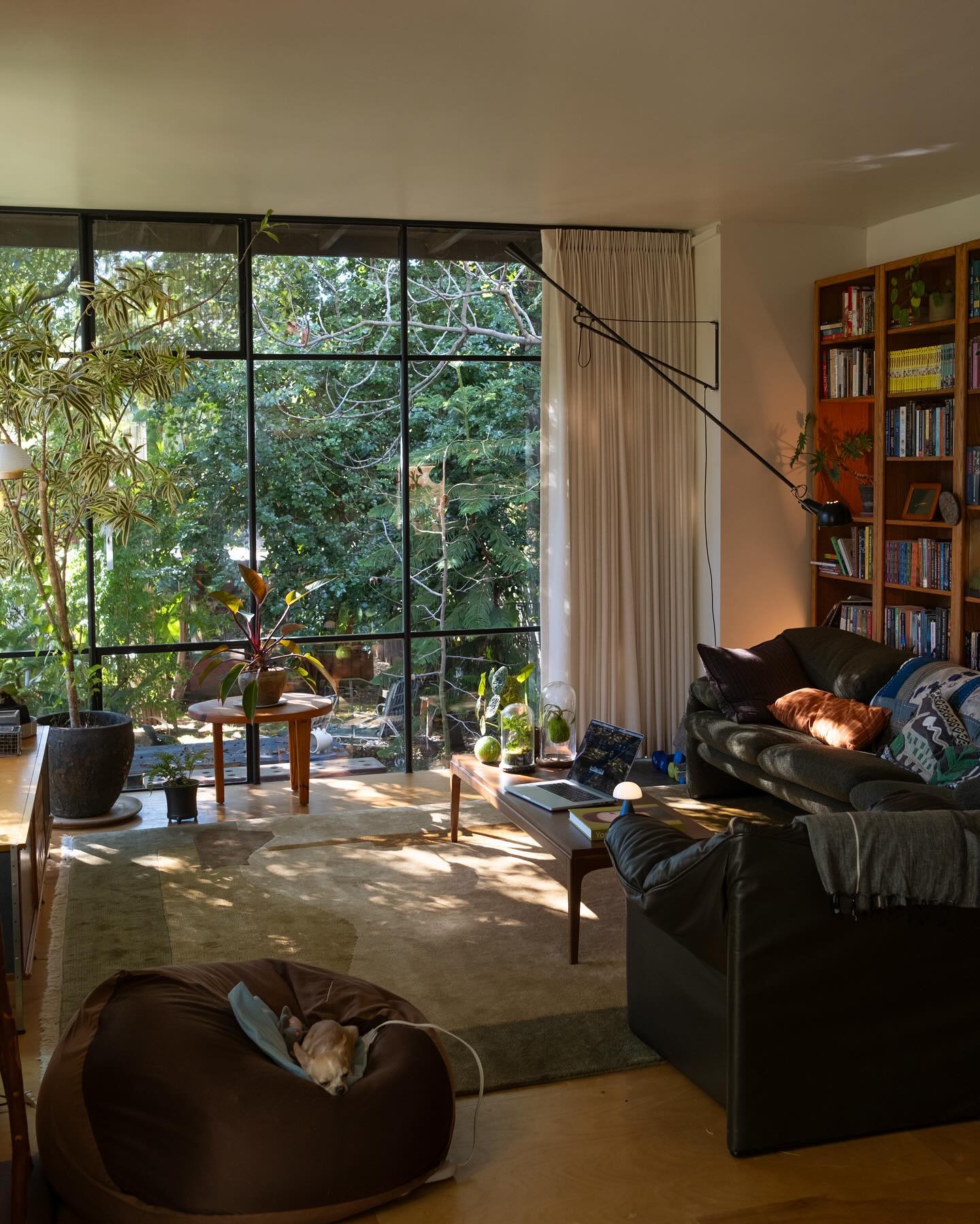 Photo by @benji_plant
Staple Pieces of Mid-Century Modern Interior Design
With the resurgence of this art form so prominent today, it makes sense that interior designers want to find more authentic pieces. Unlike in prior centuries, furniture and décor elements were made more in factories than ever during MCM. That means that, in some regards, pieces didn’t last as long as previous generations of finely carved, intricate wood.
Yet, there are some outstanding MCM interior design pieces, authentic or reproductions, that make for a fascinating display in any room.
The Eames lounge chairs
Quite the statement piece still today, the Charles and Ray Eames husband-and-wife team made its mark with the Eames lounge chair. It was designed to look like a massive first baseman’s mitt. The chair had a deep seat and high sides. It enveloped anyone who sat down. Its plywood construction was a nearly material. Yet, the chair also incorporated more traditional plush leather.
Teak sideboards
Deeply coloured teak is another core component of midcentury modern furniture. This design element incorporates a Scandinavian aesthetic. Teak sideboards often feature a wooden frame in a simplistic, low-stature cabinet. They were designed to fit seamlessly into any space. There was nothing too ornate here. Simple lines defined MCM furniture.
Egg chairs
Arne Jacobsen’s egg chairs were another main component of this timeframe. These chairs were brought with steel and wooden frames. They had a geometric shape quite unlike any other. The molded piece of foam just under the upholstery is what gave them the clean lines they became known for.
Paris lamps
Louis Poulsen’s Paris lamps are another hallmark feature of this time period. These lamps aimed to “fix” the problem of intense light from electric lighting. They often featured rounded shades that had layers. This would help to reduce the bright light creating more of a softer glow.
Nelson bubble lamps
Another lighting option commonly found during this period was the Nelson bubble lamp. They came to fashion in the 1950s. Organic shapes, like lotus and pears, made these lamps a standout option. Yet, they were far removed from the more ornate designs heavily used prior to this period. Instead, these lamps were covered in steel wires and had white plastic spray on them.
 ## What Is Mid-Century Modern Art?
What tells the tale of MCM more so than the furniture of the time? It was the art. MCM art often incorporated the same concepts. That includes simple geometry and clean lines. Bright colours (in orange, green, and yellow hues) against natural materials are also common here.
Notably, mid-century art can also include other elements. This was also a time when Pop Art and Abstract Expressionism moved into the era.
What makes MCM special is that it gets rid of the “extras.” That is, clean lines instead of ornate detailing fill each piece. They are geometrically simplistic displays. This, along with the inclusion of metals and plastics, really defined the art movement of the middle of the century.
What Is Mid-Century Modern Architecture?
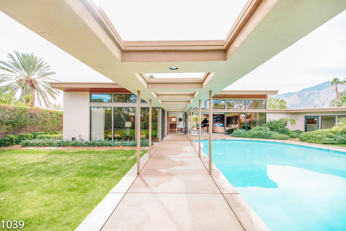 Frank Sinatra’s Twin Palms helped the Mid Century Modern style gain popularity after World War II Photo courtesy of Sinatra House
The thrill of MCM wasn’t just contained within homes and offices. In fact, the exterior of buildings set the tone for a whole new look of homes and shared spaces. This architectural style was vibrant in a way. People were more optimistic after the war. They had new materials to use, including concrete and steel. They also had fabulous features like insulated glass that could give them more variety in design.
Yet, the same simplistic design elements are present in the architecture of the period, too. Instead of more ornately designed buildings, they were simple. Functional dominated all aspects of design here. Designers communicated through less frills and better function. The architectural style of this period was quite different from the previous.
Instead of boxed-off rooms, open floor plans started to make their way into interior design. Open, flowing spaces allowed people to meld better with the outdoors as well. People had larger windows with more natural light pouring into spaces.
Some of the most notable mid-century modern architects of the time included A. Quincy Jones, Pierre Koenig, and Eero Saarinen. Important to note, though, that people were still very financially conscious. Not all homes were torn down or newly constructed. Many were remodelled to incorporate these styles.
As for architectural elements found in the mid-century modern homes, you’ll find several key features:
-
Clean lines throughout the exterior and interior structure
-
Indoor and outdoor living, such as with open patios and patio doors leading out to bigger paces
-
More windows – including floor-to-ceiling windows – allowing better natural light
-
Wood, inside and out, on the walls, floors, and even the ceiling in some areas
-
Built-ins were a newer design element for the time
-
Open floor plans were at their very early stages here, with fewer destination rooms and more functional spaces for crowds
-
Functionality was the most important element here
Some of the most notable of mid-century modern architecture remain standing today. Explore these homes to see exactly what this style was like and why it was so critically acclaimed.
-
Eero Saarinen’s World Air Flight Center in New York: This property opened in 1962 and provided perhaps the most impressive of spaces. It looks like a bird in flight. With the touch of futuristic design, this property is beautifully designed with big windows and open spaces.
-
Richard Neutra’s Kaufmann House in California: A very different style of home than previous generations, this property is known for its split-level design. Still lavish, it was more of a simple and elegant design. The flow of interior and exterior is what helped define this period. Most notably, this home features an inground pool with lots of space for chatting.
-
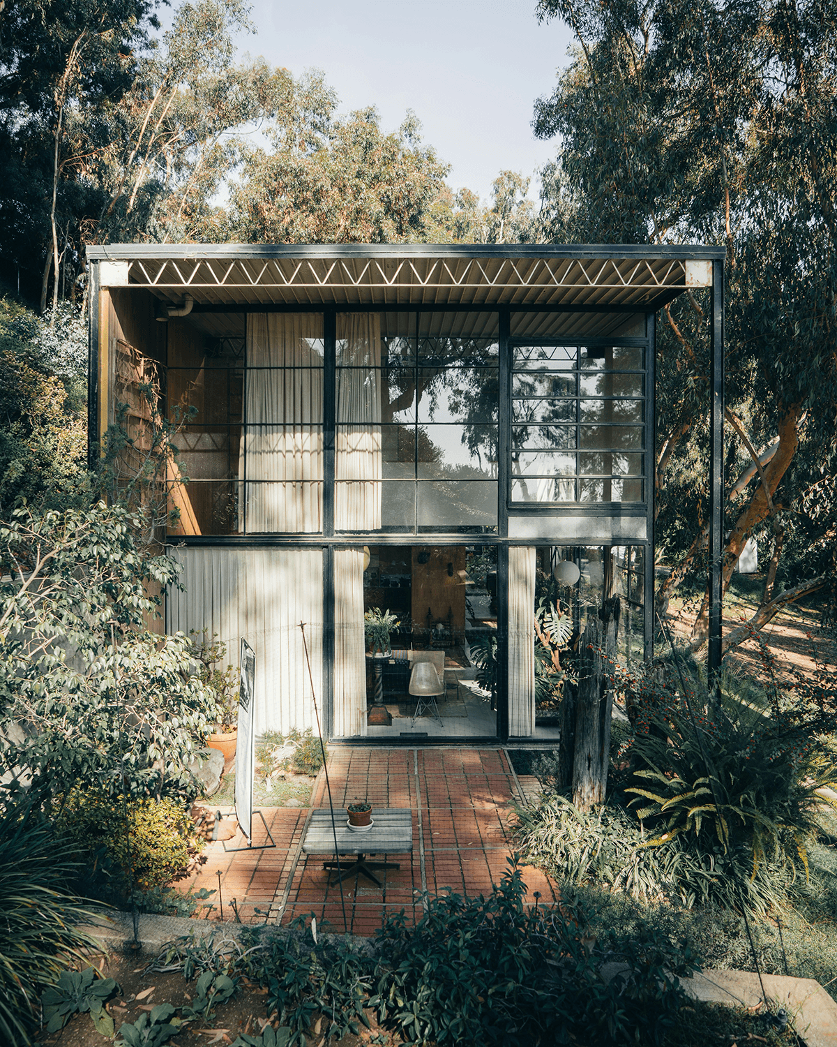
Charles and Ray Eames House in California: This style of home was quite prominent. It featured a home with two raised steel and glass structures. Both pieces had a flat roof. Both also incorporated bright color blocks. Yet, they were set in natural spaces with bigger gardens.
The architectural elements of this period are hard to ignore, even in today’s design. Mid-century modern architecture was bold for its time period yet simplistic in its actual features and beauty.
What Is Mid-Century Modern Landscaping?
It’s important not to overlook the prominent of landscaping during this era either. Many of the same design elements remain – simple and refined – but landscaping became more of an expectation during this timeframe. That is, people were doing more of their own gardening, but simple, beautiful landscaping was a defining element of status.
The style included:
-
Clean lines throughout
-
Curved shapes that were less organic in natural
-
Elements that incorporated privacy, such as taller shrubbery
-
More native elements, including wildflowers and evergreens
-
Perennials came on the scene as an easy-to-care-for pop of much-needed colour
Several elements brought this MCM landscaping to life. As noted, the blending of interior and outdoor backyards was a core component. People were spending more time out by the pool and relaxing with friends on the patio.
At the same time, design elements remained very minimal. These are not English gardens with detailed designs and intricately sculpted shrubs. Instead, more natural material was present. Modular patterns were also notable. These gave more of a modern and futuristic appeal to the area. Don’t overlook the importance of functional furniture as well. These pieces incorporated clean lines and more geometric elements. Yet, for the first time, they encouraged relaxation outdoors with a touch of comfort.
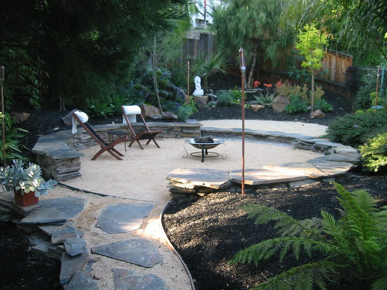 *Photo by *beaudrydesign.com
Bringing MCM Into Today’s Interior Design
There are many benefits to incorporating MCM into today’s interior design. First, it is the rage. The fact is, people love the simplistic elements of this design period. Second, it is easier than ever to create this type of stunning experience with high-quality pieces readily available to bring them home.
Consider the interior design of a single room. To capture the MCM look, carefully select one specific element with MCM flare. It could be a kidney-bean-shaped dining table. It may be one of the egg chairs. Then, design around this with limited artwork and a refined colour palette. Don’t overlook the need for natural light and materials in the space.
When it comes to colour, it's an interesting period. MCM is all about nature, but there's still a twinge of fun incorporated within it. That comes from bright colours tossed into the design. Expect yellow and orange colours to dominate. Look for retro patterns, too.
Most importantly, MCM is about bringing nature back to life after years of struggle through war. Natural landscaping, materials, and architectural designs help to communicate this. Look for ways to balance interior and exterior spaces, like open floor plans.
With so many exceptional examples of MCM designers and architecture still present, it’s easier than ever to bring this style to life today.